Keyvisual Storyboard References Gallery
Starbucks Corporation is an American coffee company and coffeehouse chain. Starbucks was founded in Seattle, Washington in 1971. As of early 2019, the company operates over 30,000 locations worldwide. As of April 2019, Starbucks China is present in the People’s Republic of China with around 3,600 stores. At the end of December in 2017, the world biggest Starbucks China store opened at HKRI Taikoo Hui in Shanghai.
Details
Brand : STARBUCKS China (Shanghai Team)
Team : MADJOR – a Labbrand Group company (Shanghai)
Services : Key-visual, Storyline, Storyboard, Art direction
Platforms : National dissemination (on-store, digital social platforms)
Status : Ideation, Conceptualization, Prototyping
Context & Challenges
The following visuals and documents are a short selection of creative items produced for the launching of Starbucks Delivers™ service in China. A campaign simultaneously supported by different Starbucks China partners (Labbrand, 饿了么 Ele.me, Neocha). One of the main challenge was to cope with the late launching of this local service. Indeed, at this time, the delivery service in China was already proposed since a long time by all main Starbucks China competitors. The content presented here includes notes, suggestions and management consulting for key visual expression, video storyline, storyboard and art direction.

Key visual expression
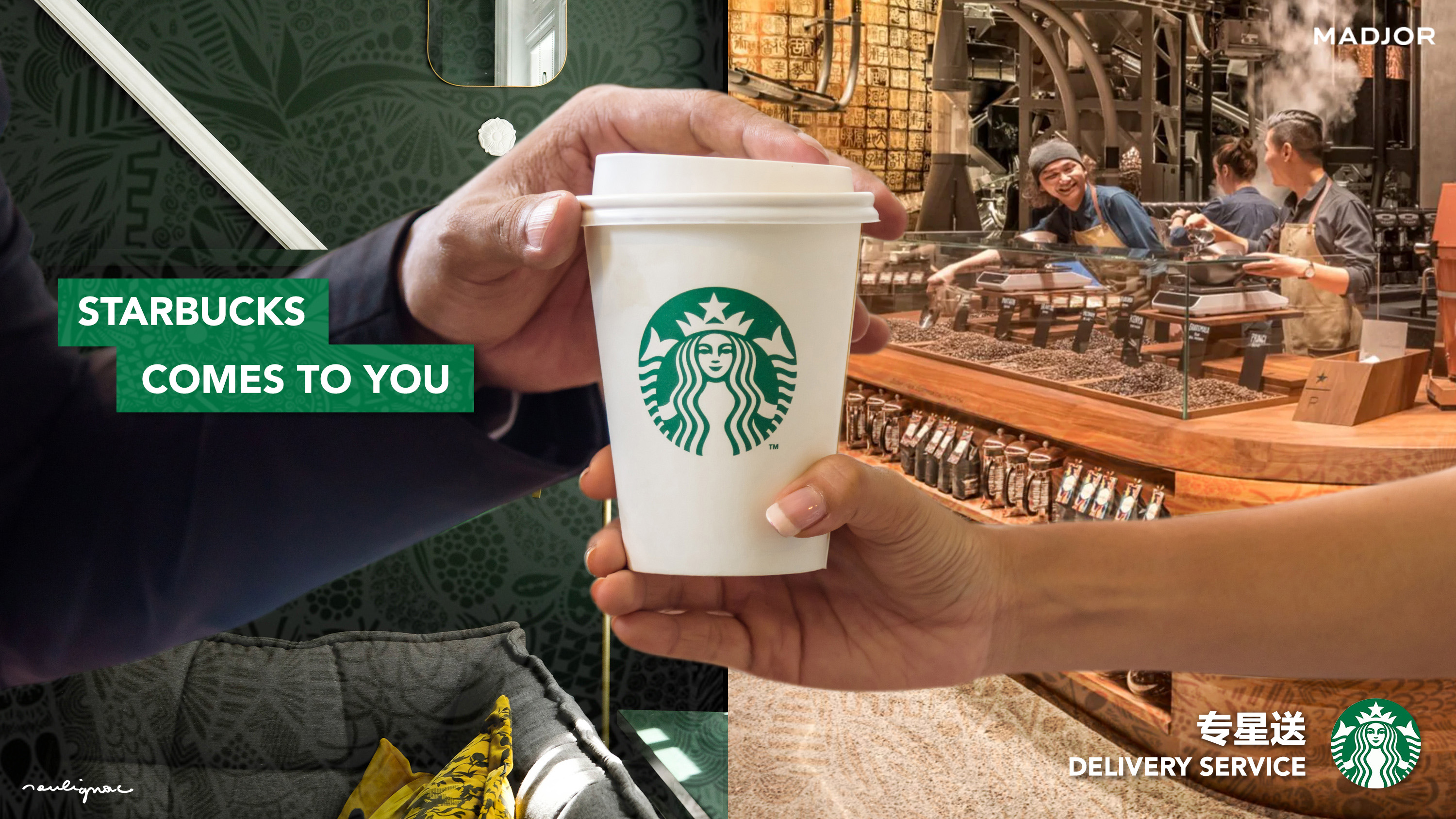
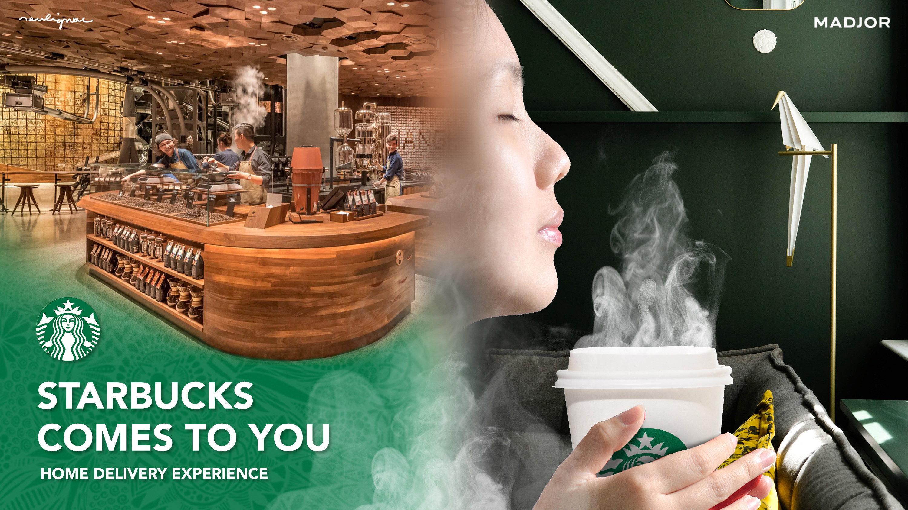
Starbucks Comes to You
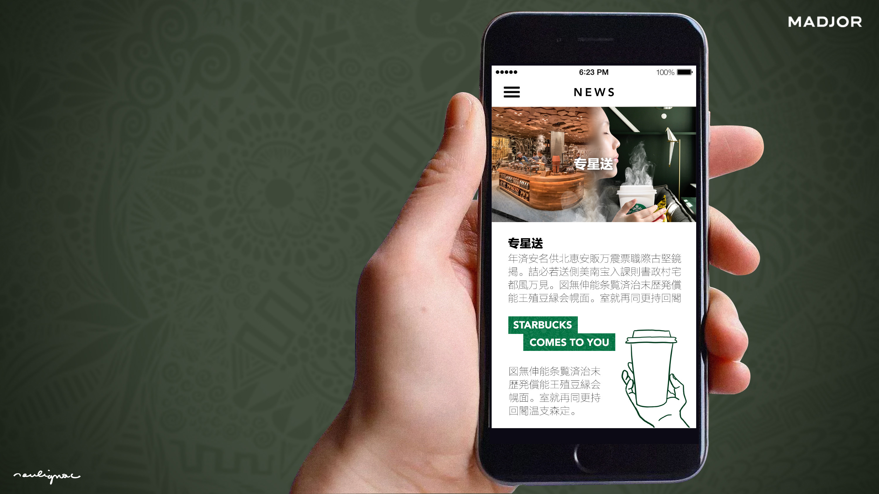
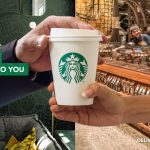
Starbucks Comes to You, Key visual expression by François Soulignac, MADJOR Labbrand Shanghai.
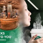
Starbucks Comes to You, Digital use of key visual expression by François Soulignac, MADJOR Labbrand Shanghai.

Video storyline & storyboard
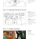
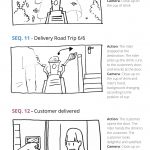
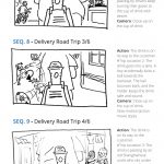
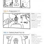
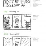
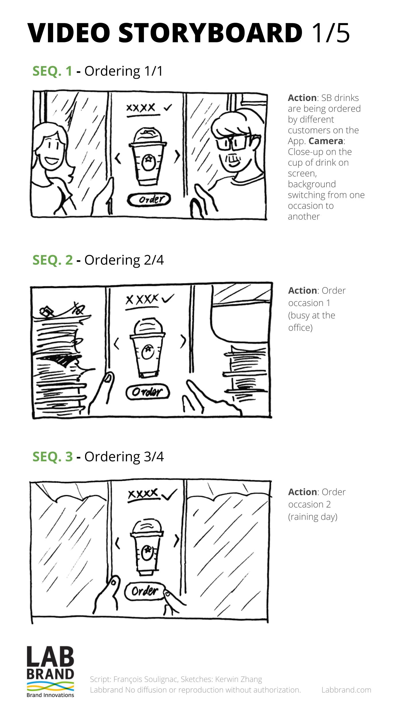
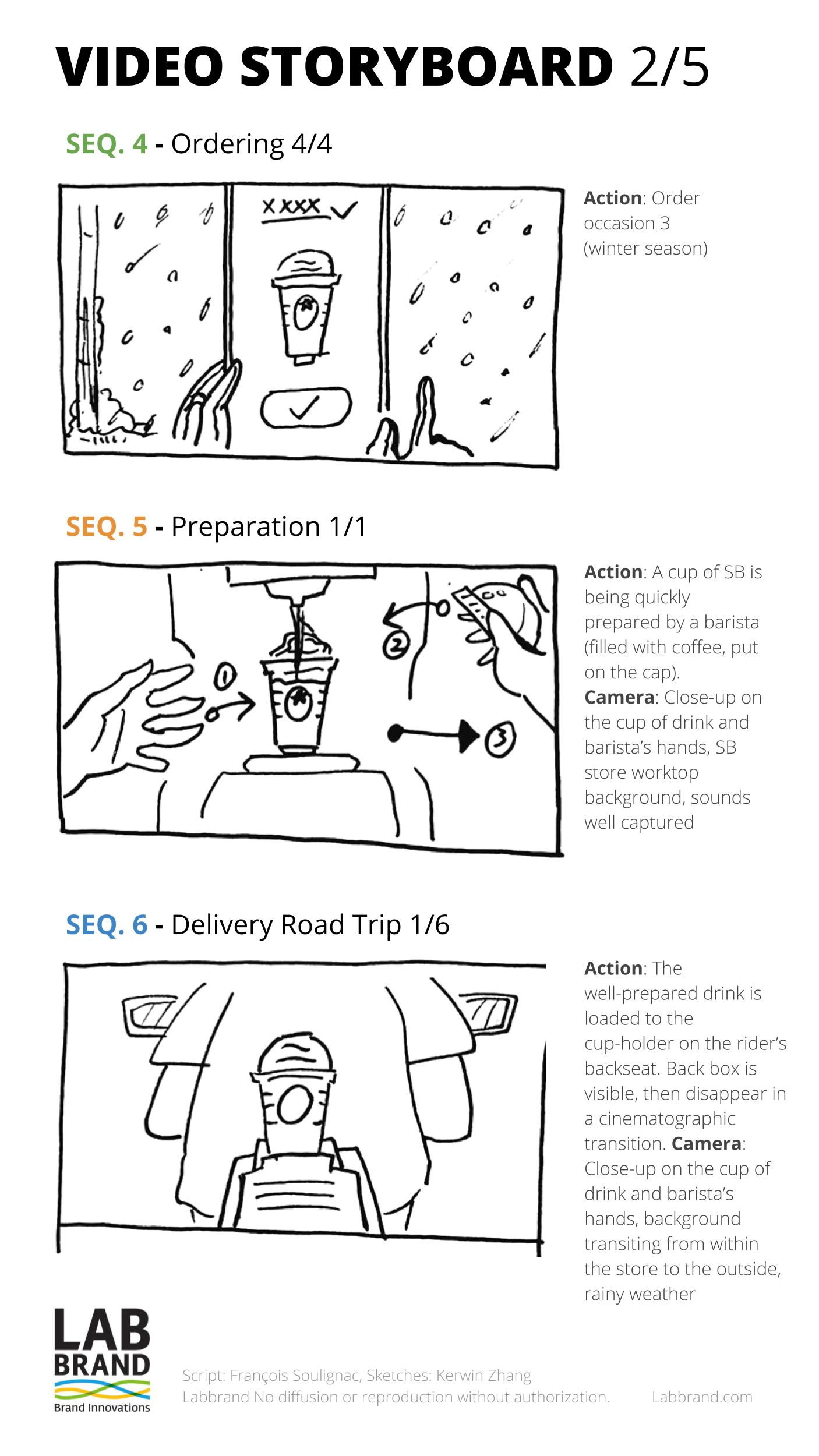
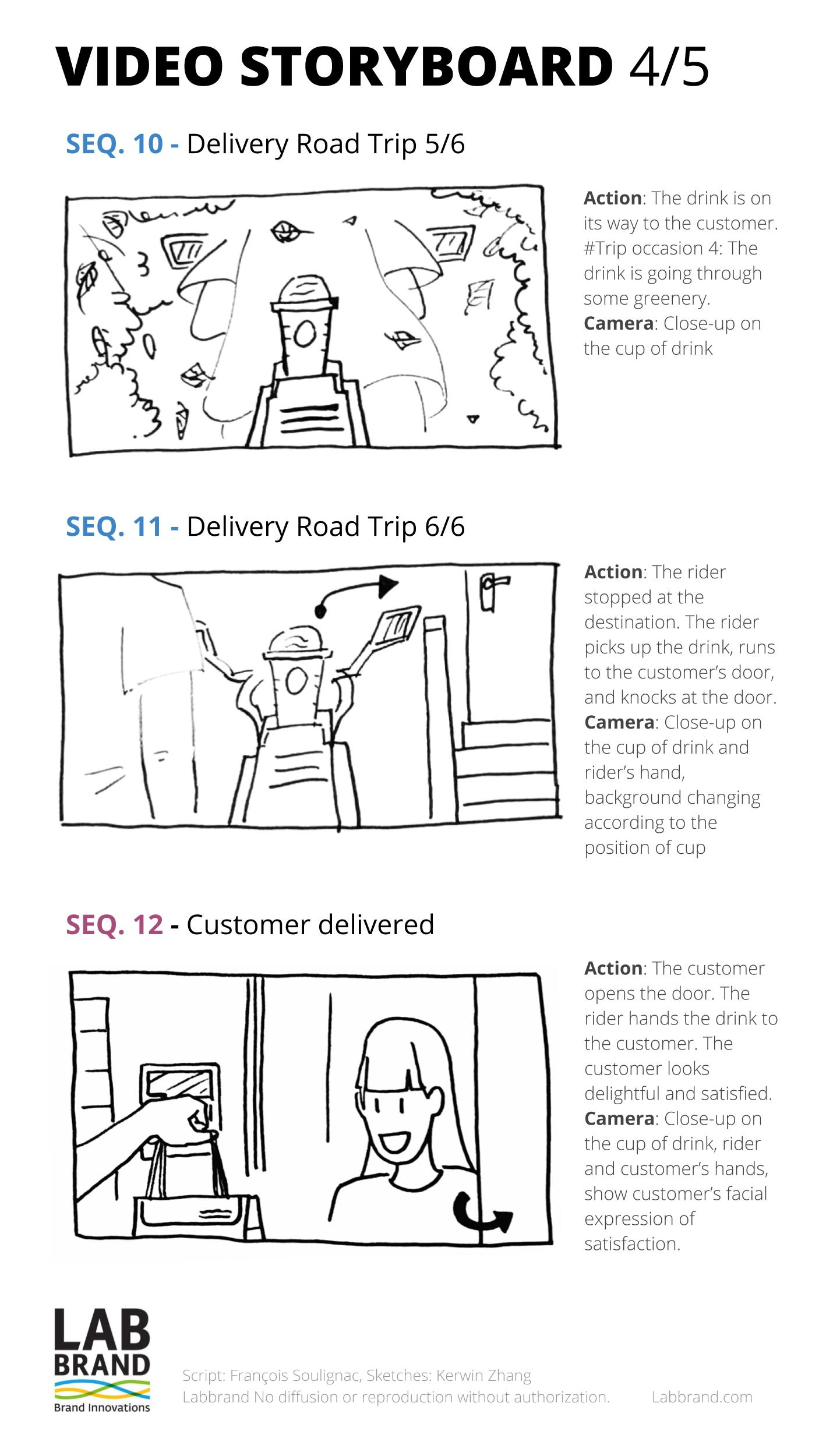
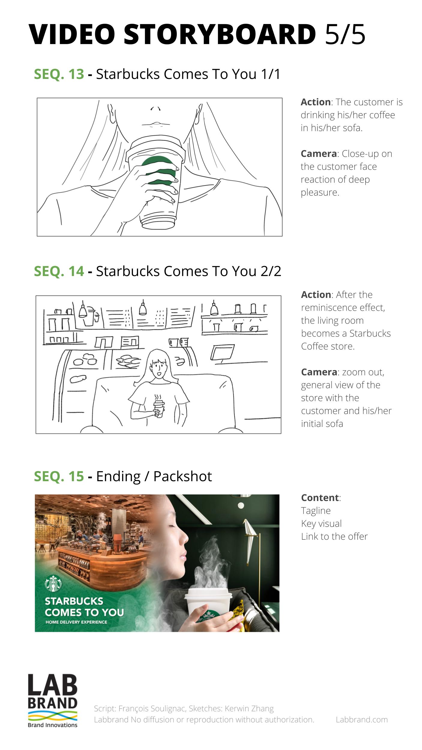
Starbucks Comes to You, Video storyboard by Francois Soulignac, Sketches by Kerwin Zhang, MADJOR Labbrand Shanghai.

Video storyline
Starbucks China | Home delivery experience
The story introduces the journey of a delivered Starbucks cup (ordering to delivering) from the point of view of the product itself. As main character, the cup is always in the middle of the screen, passing from hands to hands. The audience will experiment the Starbucks home delivery process from the inside. The story shows the actual delivery process but with a touch of fantasy to make the format attaching and memorable. Also, in order to avoid exotic clichés and to stay relevant with Chinese urban modernity, the local mini-stories happening during the road-trip has been brainstormed with native Chinese team members.
Connection & Chinese urban lifestyle
The human connection is expressed by the hands crossing the cup during the journey (Barista > Delivery man > Customer). A various, modern and authentic selection of Chinese lifestyle is represented during each phases of the story. The ordering phase shows daily life occasions of consumption; the delivery road trip (in Shanghai or Shenzhen) is an opportunity to celebrate the very unique urban identity of Chinese megalopolis; then, the last sequence of delivery reception at the door is a perfect momentum to represent the exact variety of profiles and lifestyles of the targeted audience defined by the Market Research Team.

Video sequences | Series A
Customer ordering
Those sequences are the opening, introducing the main characters. The users are ordering Starbucks with the native Starbucks App during different occasions. Camera focused on mobile phone’s screen in hands. The selected drinks are visible on the UI. The surrounding and the cup are changing according the selected occasions (Home, office, Street, Snowy, Rainy…). Hands of user and mobile phone could be fully covered by snow / rain, to express the fact that you can order anytime, especially during inclement weather. At the end, the video stays focused on 1 user, 1 cup (neutral Starbucks cup, white and green logo), then the user clicks on “order”.
Video sequences | Series B
Order preparation
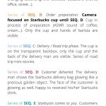
Those sequences are the development, rising action in the Starbucks’ side. Cup in process of preparation (sound of coffee, sound of cream…). Hands of the coffee maker are visible. Extreme short sequence to make an emphasis of the standardization and efficiency. At the end of the preparation process, the cup is moved on a trail, on the direction of the delivery deck. A group of delivery men are waiting with their scooters, ready to start, with the focused attitude of competitive runner. IMPORTANT NOTE: the series A & B must be short (5~10 seconds) in order to drive the audience to the climax (the catchy road trip sequence) and to optimize the average view duration.

Order preparation | Sound design references
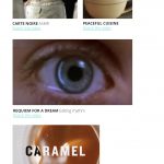
Sound design reference – Unintentional ASMR | How to Make Pumpkin Spice Latte (extract). Original video by Peaceful Cuisine.
Order preparation | Editing style reference
Editing style reference | Requiem for a Dream (extract). Directed by Darren Aronofsky.
Video sequences | Series C
Delivery man / Road trip
This series of sequence is the climax. Oriented on speed, action and human connections. Showing typical Shanghainese life interactions. The cup is on the back-box, but transparent, only the cup and the back of the delivery man are visible. Example of road trip mini-stories: Scooter race between other delivery services competitors (super serious funny attitude); Delivery man stopping his scooter to help another competitors falling down (competitors but humans); Delivery man avoiding accident “like a boss” (slow motion, Cantonese action movie style); Delivery man protecting the cup from third element like soccer ball.

Road trip | Framing references
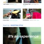
Product framing reference | Cast Away (extract). Directed by Robert Zemeckis.
Road trip | Shooting & Editing style reference
Editing style reference | “Bourne” film series – Direction analysis (extract). Original video by INSIDER. Read the article.
Video sequences | Series D
Customer delivered
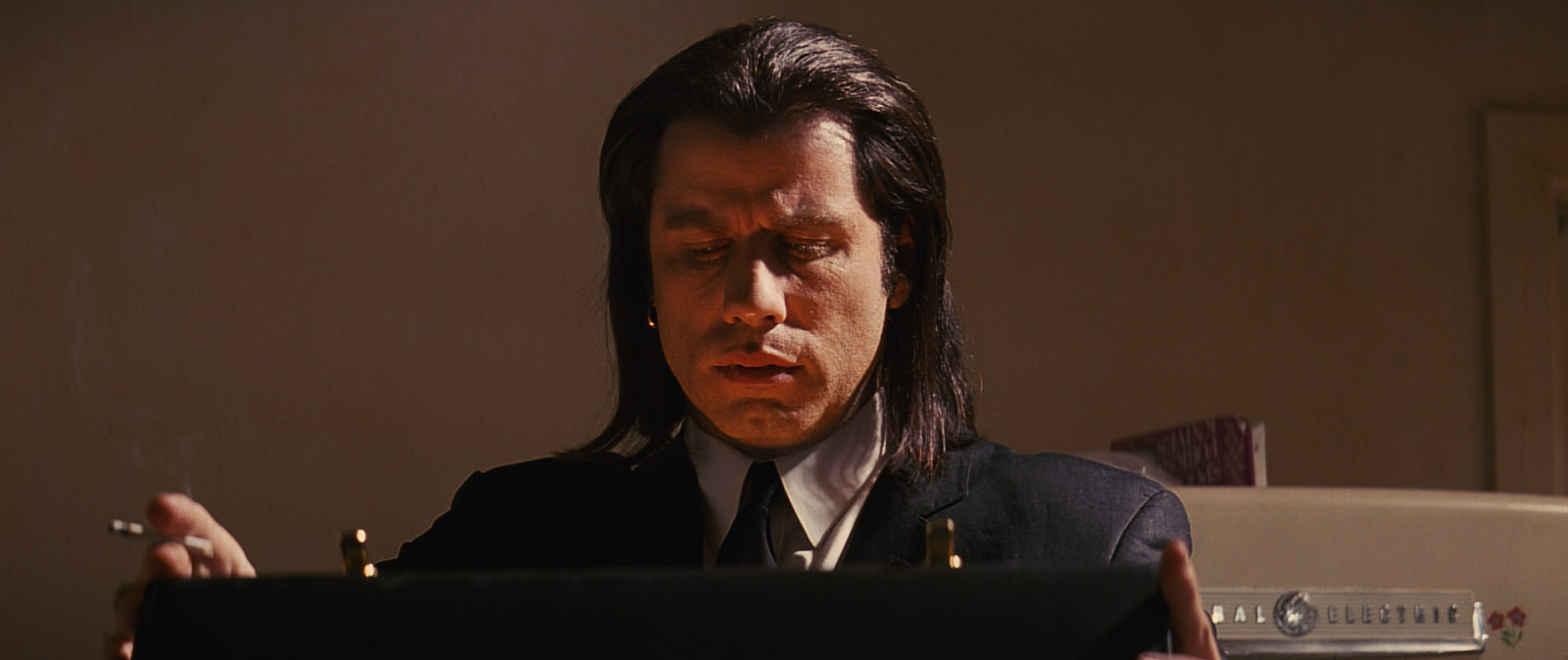
This sequence is the resolution of the story. The delivery man shows the Starbucks delivery bag glowing like a precious golden object – the MacGuffin. The face of the customer is glowing as well, so happy and satisfy to receive his/her Starbucks drink. N.B: The Pulp Fiction golden suitcase reference has been suggested by the client to illustrate the customer facing the “Mysterious Drink”, a special home delivery offer.
Delivery | Satisfaction face references
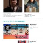
Glowing effect reference | Pulp Fiction’s MacGuffin – Golden suitcase scene. Directed by Quentin Tarantino.
Glowing effect reference | Grubhub – Behind all the orders (extract) | Delivery scene. Original video by Grubhub.
Video sequences | Series E
Starbucks comes to you
This sequence is the closing scene. Final customer seated on the comfy sofa of their living room, tasting carefully the Starbucks coffee, just by the edge of their lips (the coffee is still hot), eyes closed. Suddenly, triggered by the drink food quality, the customer is touched by a “reminiscence” coming from a previous Starbucks in-store experience. Then the casual home turns into a fancy Starbucks store (E.G: Shanghai Roastery).
Delivery | Reminiscence experience
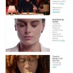
Reminiscence effect reference | Ratatouille (extract). Co-Directed by Brad Bird & Jan Pinkava.
Delivery | Reminiscence experience
Reminiscence effect reference | Antithesis – Cartier. Video by Cartier.
Art direction | Additional notes
Style & Tonality
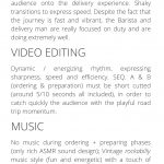
Real-live shooting, natural light. A realistic representation to immerse better the audience onto the delivery experience. Shaky transitions to express speed. Despite the fact that the journey is fast and vibrant, the Barista and delivery man are really focused on duty and are doing extremely well. During the road trip, avoid any sensations of “danger”, to be replaced by “playful tension”.
Video editing
Dynamic / energizing rhythm, expressing sharpness, speed and efficiency. SEQ. A & B (ordering & preparation) must be reduced to a minimum duration (around 5/10 seconds all included), in order to catch quickly the audience with the playful road trip momentum and improve therefore the average viewing time duration.
Music editing
No music during the order process + preparing phases (only with rich ASMR sound design) in order to avoid the distraction and keep the audience focused on the UI branding of the native App and the coffee making process; vintage Western music style with a touch of Asian instruments during the road trip (E.G: rockabilly classic cover played with Asian instruments). Important note for the global rythmic structure : playful and energetic music during the road trip; no music during the slow motion moments inspired by Cantonese action movies; Silence when the delivery man arrives to the delivery point; soft delightful music at the very moment of the reminiscence experience.
Items: Key visual expression mockup, Video storyboard (concept, prototyping, visual references). Content: Creative assets for the launching campaign of Starbucks China home delivery service. Market: China. Job done: art direction, storytelling, story-boarding, production management for storyboard sketching.

Photos gallery
© 2018, MADJOR Labbrand Shanghai for Starbucks China (Shanghai Team) – François Soulignac, Digital Arts Management.
