Brand Story Photo Design Video Gallery
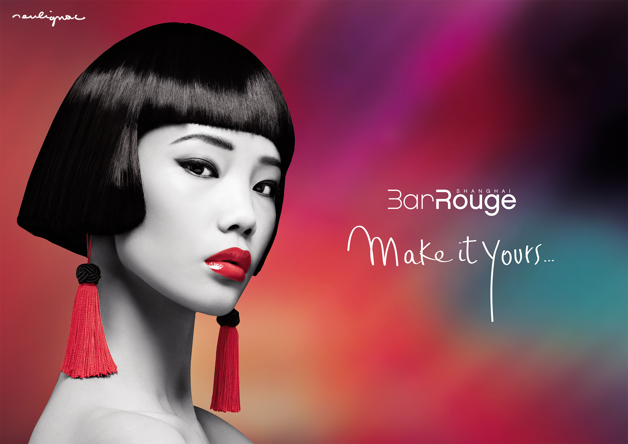
Bar Rouge Shanghai is the oldest night club in Shanghai and one of the most famous night club based in China, awarded by the World’s Finest Club. Bar Rouge Shanghai is a brand owned by VOL Group China, a leading actor of the food and beverage industry in Shanghai.
Details
Brand : Bar Rouge Shanghai, VOL Group China
Projects : Creative direction, Art direction (360°), Design production quality control
Type of services : Brand identity, Graphic design, Webdesign, Creative content production
Type of supports : Print, Digital, Video, Photo, Chinese & American digital social media
Context & Challenges
The following content showcases a selection of design work completed between January 2015 and February 2017, produced or overseen by Artbeat Studio Shanghai, the in-house Creative Agency / Design Department responsible for branding, digital creative content, and design production for all brands and outlets owned by VOL Group China. By 2017, the studio was managing 5 brands, 150 projects, and approximately 3,000 design items annually across various media platforms. Read the work summary.

Client description
Bar Rouge Shanghai, China
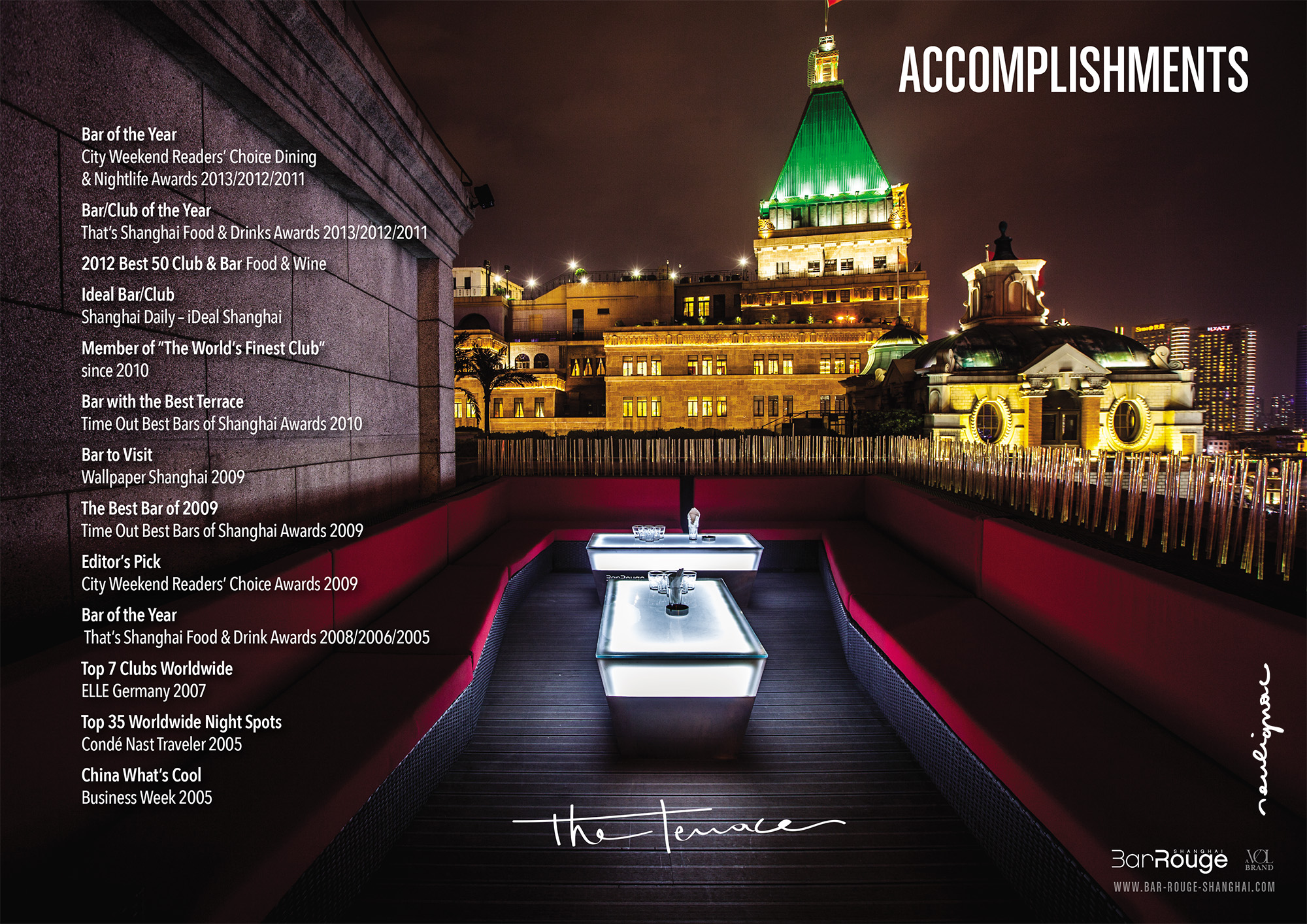
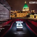
Bar Rouge Shanghai, China, International Awards and Accomplishments. Download the sales kit
The offer
“Bar Rouge Shanghai” is one of Asia’s most famous nightclubs and Shanghai’s oldest. Since 2004, it has been offering high-end events centred on four main offerings: a rooftop terrace with an exclusive view of the Pudong skyline; a premium drinks offer including a large list of Champagnes, original cocktails designed by international mixologists and cocktail makers; electronic music mainstream-oriented via a powerful home-designed sound system; and several times a year, cutting-edge invitations from the world’s best DJs, musicians and music producers. The venue is open 7 days a week, from 6pm to late.
Quotes
We have become something of a “big brother” in Shanghai’s nightlife scene. Awards aside, as an institution, we should communicate in line with this status. (Charles B., Marketing and Sales Director, VOL Group China, June 2015). We are the essence of Bar Rouge, a French brand working in, with, and for China. (Antoine K.P., Director, Bar Rouge Shanghai, 2015).
Client’s needs
The client’s needs are straightforward and comprehensive: global design, visual identity, branding, visual communication supports, and creative content production for five events planned every week, 365 days a year. “We are providing fun, music, and Champagne on the best terrace in Shanghai” (Eric T., Marketing and Sales Director, VOL Group China, February 2015). “Everyone says: Bar Rouge plays only commercial music. That’s not true. Bar Rouge also plays very fine electro music and invites the best DJs, including those from the underground scene. The audience needs to know” (Quentin F., aka Keint, Musical and Artistic Director, Bar Rouge Shanghai, February 2015).

Storytelling
Revamping the brand perception
Brodinski & Gener8ion, Brava Tour, Bar Rouge Shanghai with M Agency, Photo by Oliver Minnett from Voena, 2015
How to become a trendsetting institution
Throughout the 2000s and 2010s, Bar Rouge established itself as a cornerstone of Shanghai’s nightlife. To maintain this status, we needed to continue engaging with our loyal customers while expanding the brand’s appeal to connect with new generations. Shanghai is a city brimming with energy and young talent, marked by epic successes and endless potential. Therefore, the venue required a fresh “brand evolution.”
Gentrification & Chinese space program
The gentrification of Shanghai is accelerating faster than anywhere else in the world. The Chinese Space Program is a reality and represents a significant current and future development for the country. Collective imagination is now flourishing, and the era of “bad graphic design” made in China is a thing of the past. The mainstream Shanghainese population is far more design-conscious than it was a decade ago, when the city was primarily populated by businesspeople. Today, various influential and stylish communities, both local and foreign, are setting new standards as equals.
Etienne de Crécy, Bar Rouge Shanghai with M Agency. Photo by Pavel Shubskiy, China, 2016
How to avoid the “outdated” phenomenon
To prevent the “outdated” or “old-fashioned” label, which is common in China, we developed visual communication that aligns with our musical direction and appeals to a broad audience. Our target includes tourists, Chinese locals, expatriates, artsy communities, “ABC” (American-Born Chinese), the younger local generation, Chinese digital natives, and the ever-growing student population arriving in China.
Refreshing the visual codes
We began by carefully selecting key existing elements to maintain a connection with our loyal customers: #mainstream, #fun, #electromusic, #sexy, #electro, #deephouse, #tech-house, #champagne. However, we completely discarded the outdated “clubbing” aesthetic. For example, we removed light ray effects typical of nightclub photography from the ’90s and 2000s, and we avoided basic Photoshop effects often seen in designs by well-meaning but amateur designers in the nightlife industry (“Oh, my little cousin knows how to use Photoshop; he can make the flyer“).
Adding new key-words
Then, we introduced new keywords into the brand’s identity to guide the graphic design team and enrich creative briefings: #cinematographic, #fast, #bold, #elegant, #pudong, #gradient, #illustration, #neons, #finest, #futuristic, #natural, #artsy, #dirty, #internetaesthetic, #insolent, #timeless.

New photo standards | Art direction
Bringing back the classics
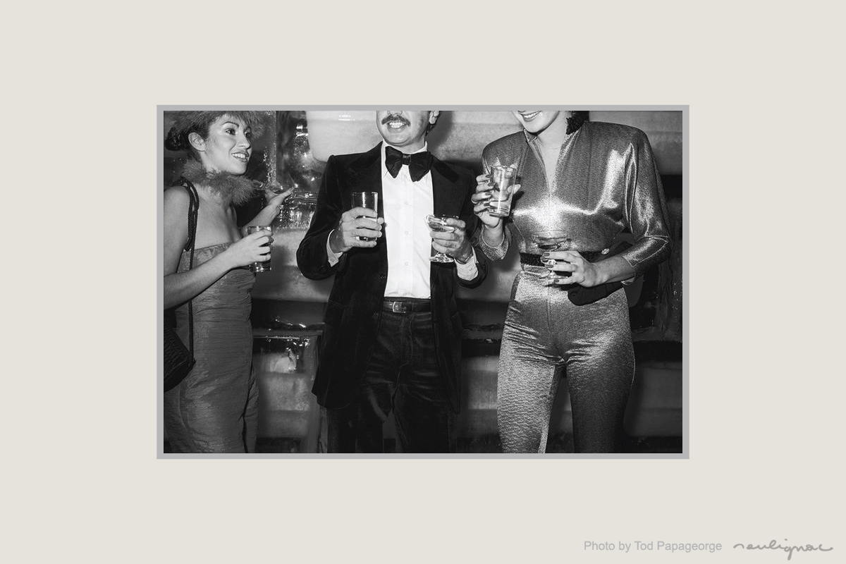
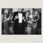
Studio 54, Photo by Tod Papageorge, New-York, USA, 1977-1981
How to capture timeless beauty
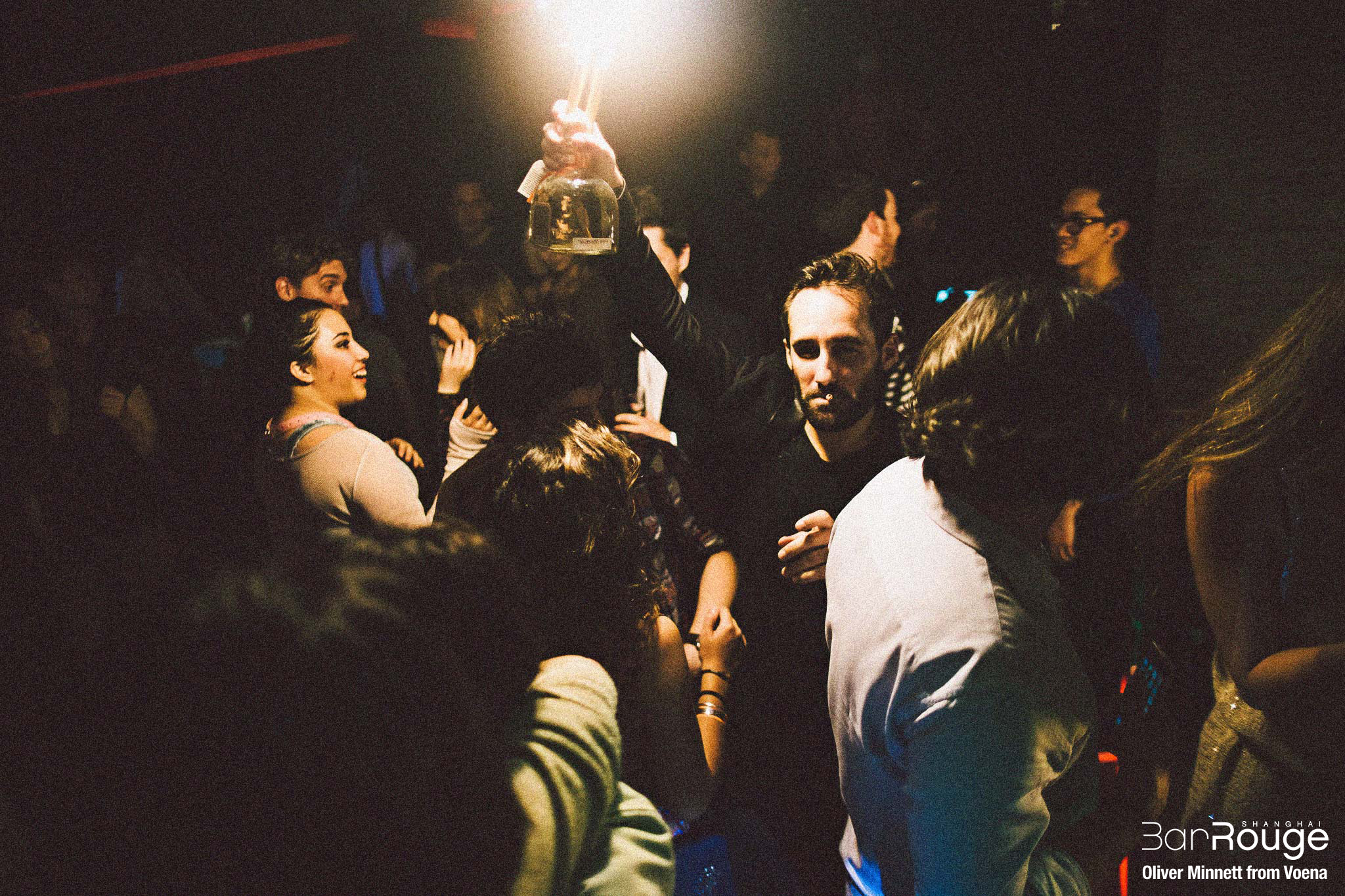
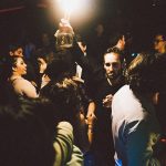
We introduced new photographic standards, drawing inspiration from current design trends and contemporary art. Influenced by both fine and unconventional arts, the photographic style was reimagined to capture the timeless beauty of the venue and its guests. In collaboration with photographers, we developed photo guidelines that include a custom Lightroom filter to define brightness, color saturation, noise, and other details aligned with the desired style for portraits, interior design, and other subjects we aimed to capture: lovers kissing (without showing faces), intimate moments between guests, extravagant individuals, unique situations, close-ups of clothing and fashion accessories, “off-camera” framing, and spontaneous happenings.
New Lightroom photo filter
The final photos taken during events, whether captured in natural light or with raw TTL electronic flashes, are slightly noisy and textured, inspired by the “je ne sais quoi” of real life and a cinematographic aesthetic. The goal of these new guidelines was to portray people as natural, authentic, and beautiful. Key references include: Studio 54, Tod Papageorge, Vice Magazine, Jean-Paul Goude, Terry Richardson, Nan Goldin, and Juergen Teller. In essence, we aimed to maintain a perfect balance between fine-mainstream and high-end underground aesthetics.
Antoine K.P., Director, Bar Rouge Shanghai with M Agency, Brodinski Brava Tour, Photo by Oliver Minnett from Voena, China, 2015.

New design | Art direction
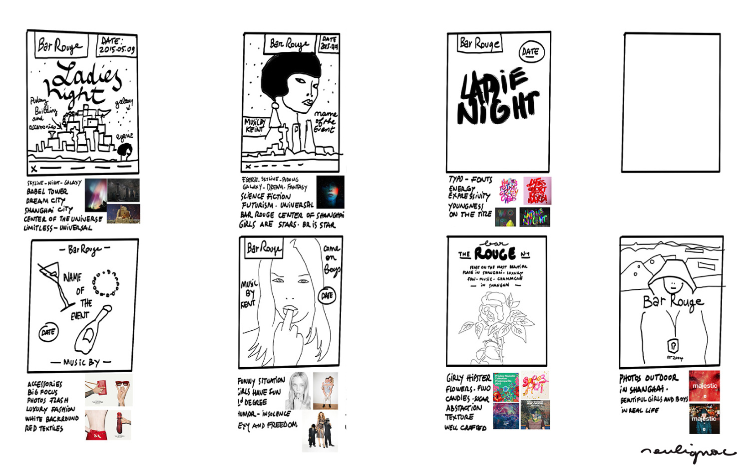
First tests & Sketches
First mood-board – Creative direction for flyers (short selection) by Francois Soulignac, Bar Rouge Shanghai, VOL Group China, 2015.
New design | Art direction
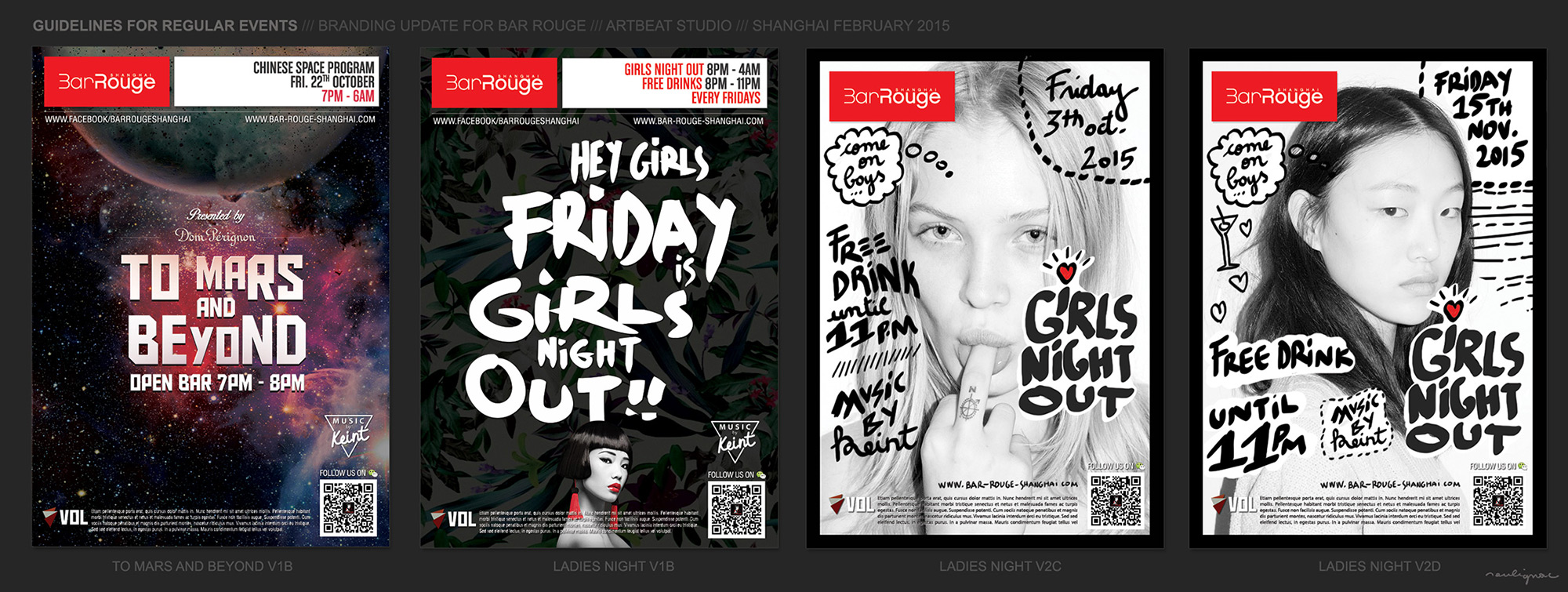
First mock-up for templates
First mock-up – New branding and art direction for flyers series (short selection), Bar Rouge Shanghai, VOL Group China, 2015.
New branding | The gradients of Pudong
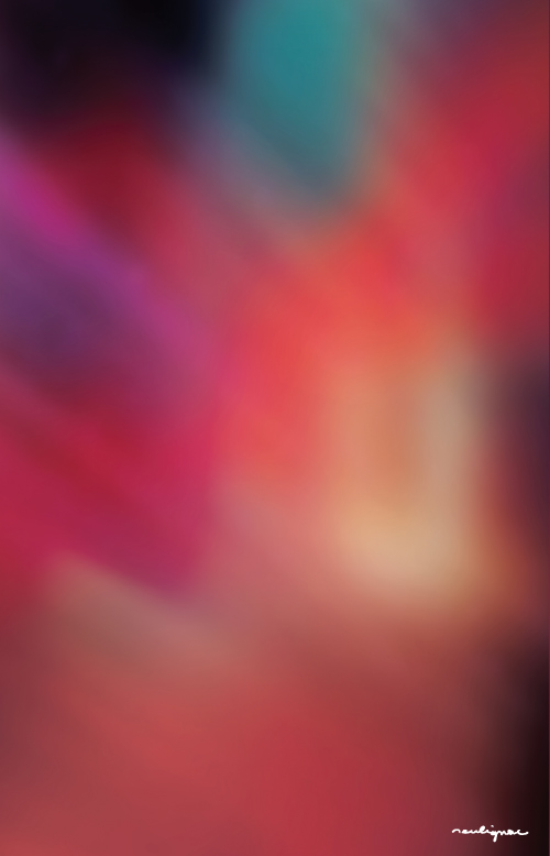

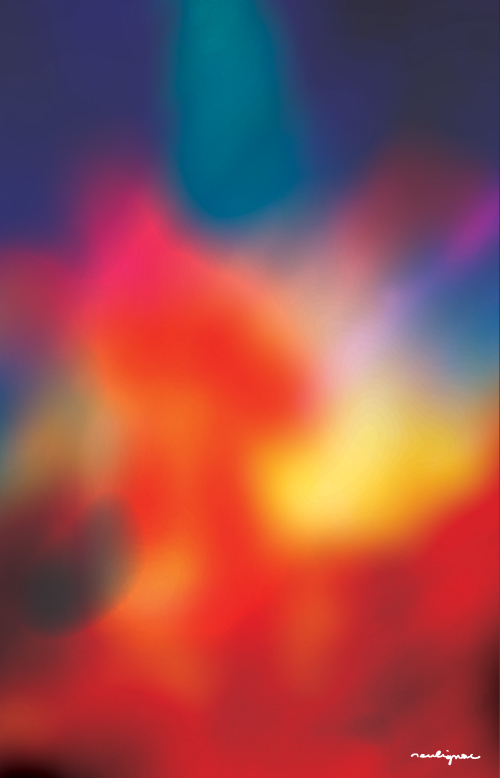
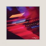
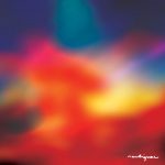
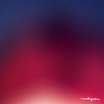
The gradients of Shanghai Pudong skyline view by night from the Bar Rouge terrace – Digital illustration by Francois Soulignac, Bar Rouge Shanghai, VOL Group China, 2015
“The gradients of Pudong” is a design series created in 2015. Inspired by the vibrant and kitschy Pudong Skyline light system (visible from Bar Rouge’s terrace), these digital abstractions have become key elements in the brand’s DNA, shaping its corporate communication and branding. The series draws influence from the video art of Jeremy Blake, notably featured in the film Punch-Drunk Love, directed by Paul Thomas Anderson.
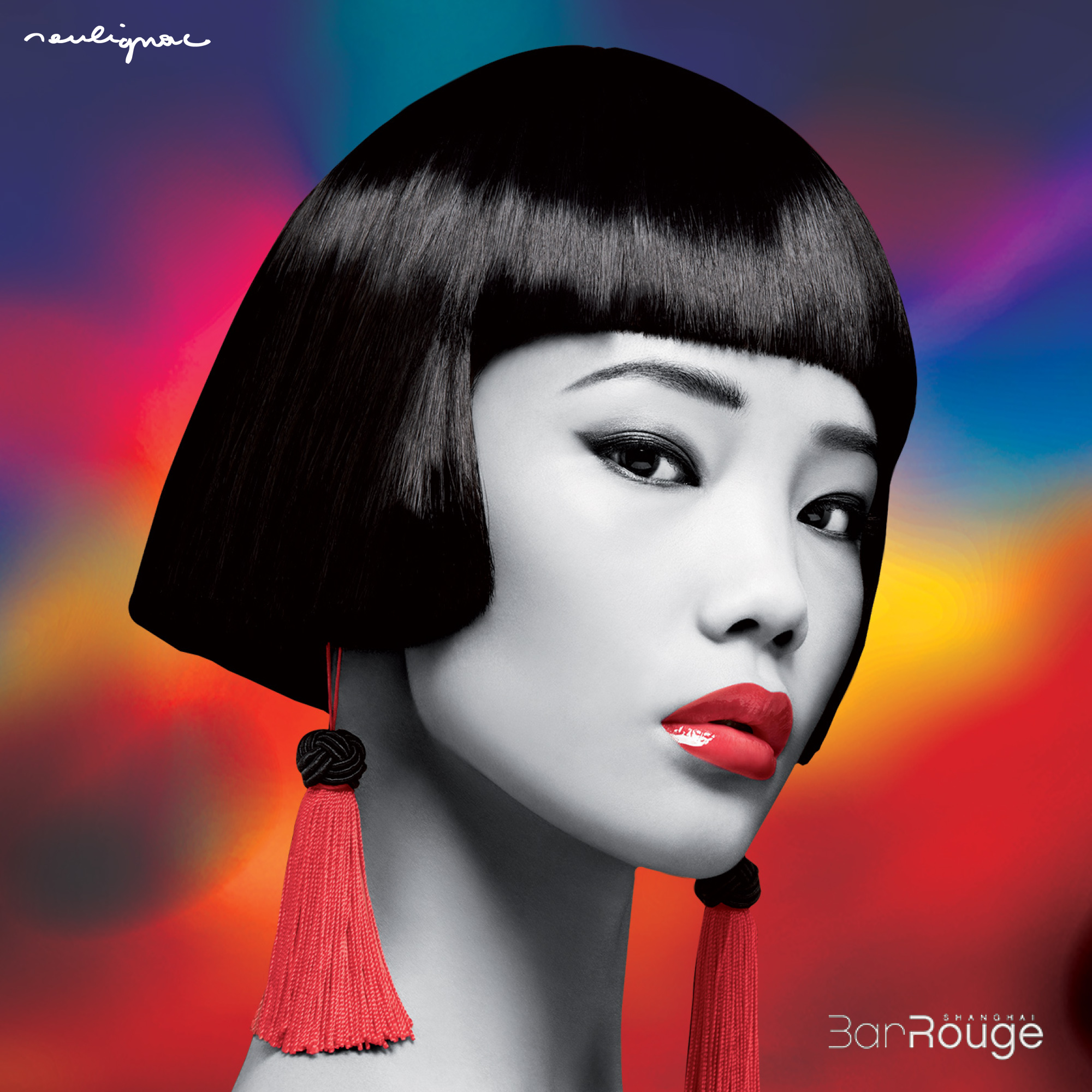
Corporate flyers using The Gradients of Pudong – Design by Francois Soulignac, Bar Rouge Shanghai, VOL Group China
New way of management
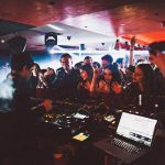
Cut Killer Dj booth, Bar Rouge Shanghai, Photo by Francois Soulignac, China, 2016
New processes of design production
Faced with a high volume of events planned throughout the year (5 events per week, 365 days a year), we had two options: hire more designers or optimize and organize our existing resources and budgets. We chose the latter.
Aside from corporate branding, most of the global design processes were simplified and refined. The new approach became more photography-oriented (utilizing both borrowed and in-house imagery), drawing inspiration from contemporary, street, and pop art. We encouraged team members to explore alternative ways of thinking, researching, and creating. With billions of images already available everywhere, at any time, we recognized them as raw creative material and made use of them. Piece by piece, by fragments, transposed, just like the sampling process done by producer DJs and beat-makers.
Visual sampling, recapture & copy-cat
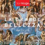
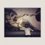
Maxime H., Bar Rouge Shanghai, La Grande Bellezza with MVP, Sampling of the Sistine Chapel by Michelangelo
The sampling of design (also known as visual sampling or recapture) is a design approach specifically developed for the VOL Group China design team. Aligned with the country’s culture, nightlife, and entertainment industry, this creative process optimizes design production, helping to meet deadlines, maintain quality standards, and reduce the department’s operating costs.
Cross-cultural bridge
For those outside of China, this approach to creation might be seen as a simplistic technique — or worse, a “non-creative” method. However, this perception is quite misguided, especially in the Chinese cultural context. The practice of copying has long been deeply embedded in both Chinese art and industrial history, forming an integral part of the nation’s tradition. A well-executed recapture, guided by careful observation and selection, is generally well-received by Chinese audiences. Furthermore, this creative method serves as a powerful tool for managing and collaborating with an international creative team, building an interesting cultural bridge between people.
Sampling & Recapture | Examples
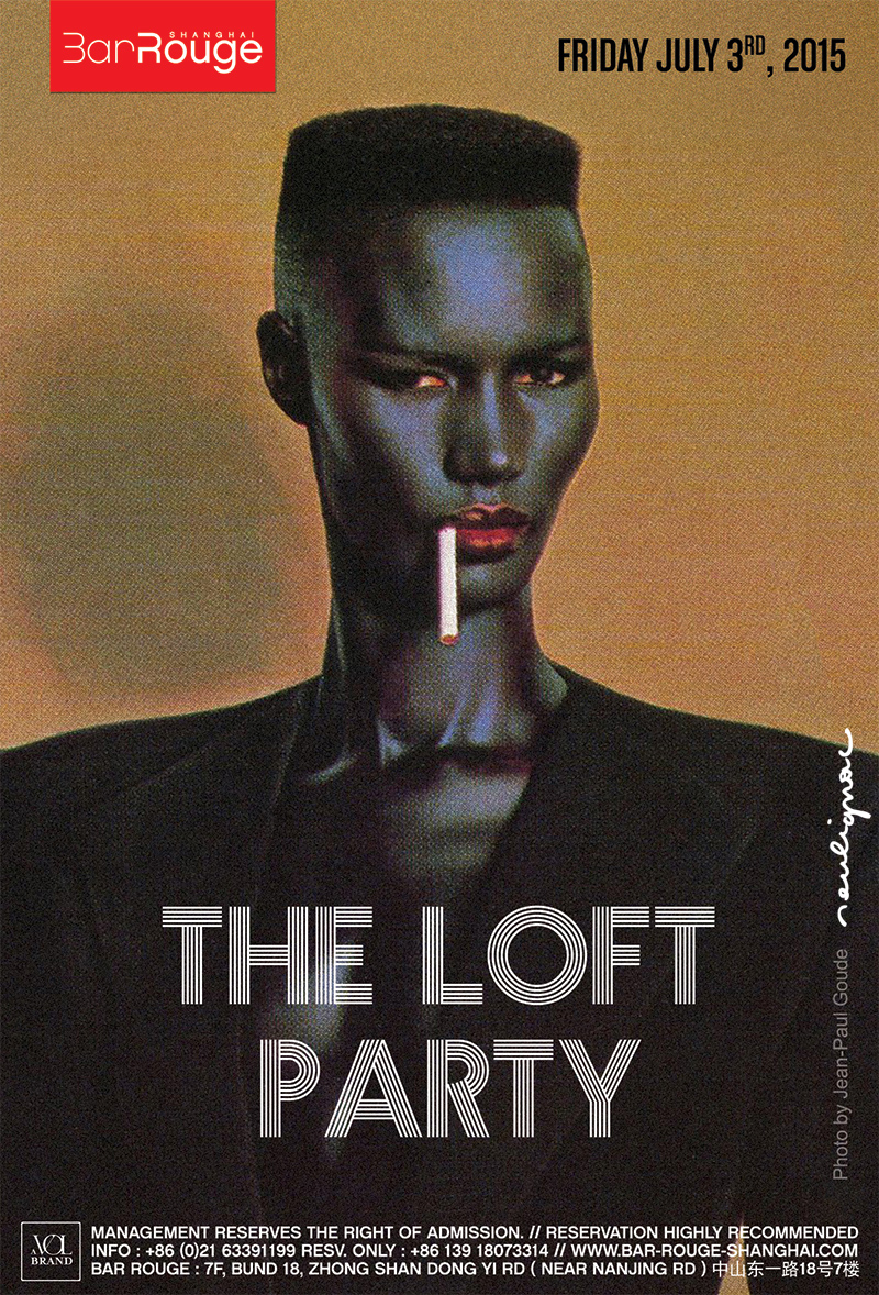

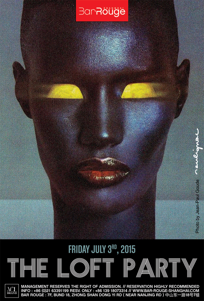
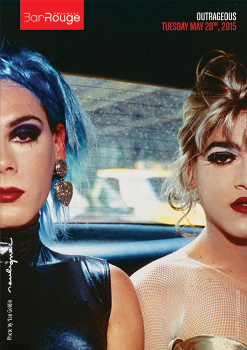
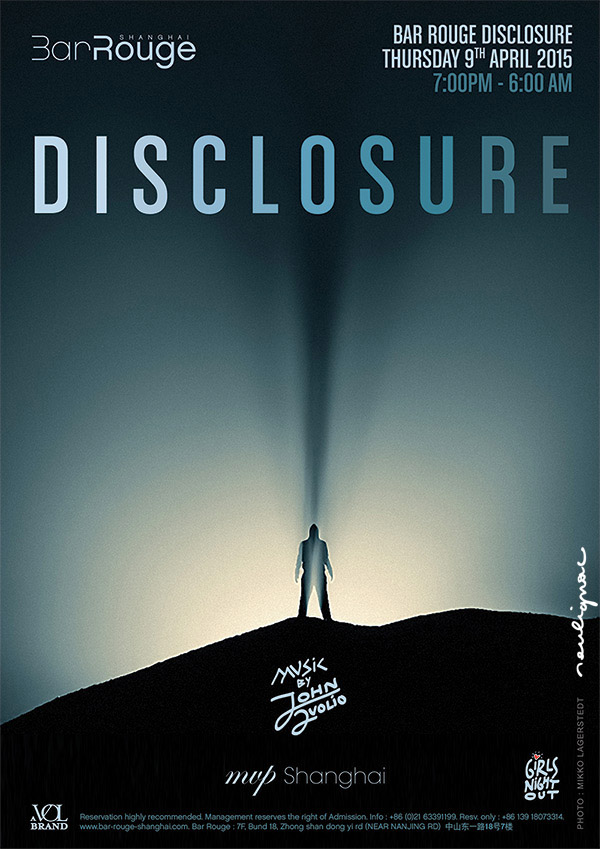

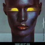
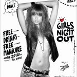
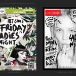
Flyers Sampling Series. Photos by Jean-Paul Goude, Tod Papageorge, Nan Goldin, Shutterstock. Visual Sampling, Art direction & Graphic design by Francois Soulignac, Bar Rouge Shanghai, VOL Group China.
Original content production
Of course, traditional methods of design and content production were also maintained throughout the process, including original design, artwork, illustration, video, and photo shoots. To offer a relevant and diverse branding solution to the VOL Group Marketing Department, we established multiple visual identities, categories, and design series.
A co-working with locals and international talents : Antoine K.P. (Director, Bar Rouge Shanghai); Charles B. (Marketing & Sales Director, VOL Group China); Quentin F. aka Keint (Photographer, Artistic and Musical Director, Bar Rouge Shanghai); Jonathan B. (Project Manager, Bar Rouge Shanghai); Clément B. (Videographer); Lynn (Graphic Designer); Shasha (Graphic Designer); Shyla T. (Graphic Designer); Toni Z. (Graphic Designer); Preacher (Graphic Designer); Julia Z. (Graphic Designer); Danara S. (Illustrator); Vitaly T. (Photographer and Videographer); Pavel S. (Photographer); Oliver M. (Art Director, Photographer); 紫宁信息科技 (Drones & Aerial views).
Chinese social media
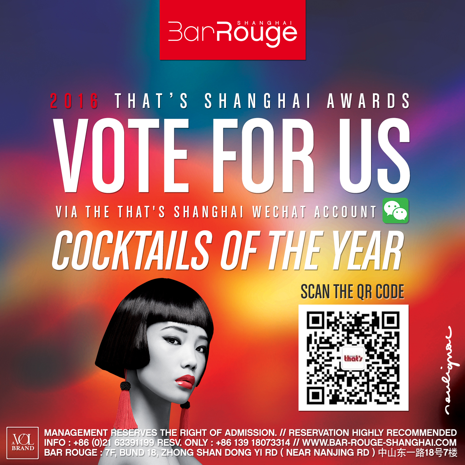
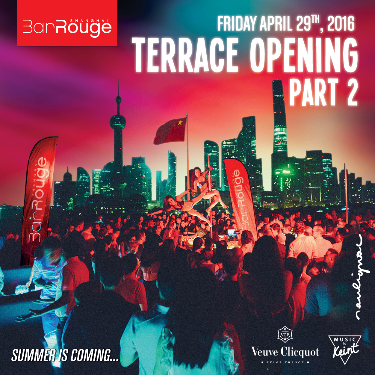
One of the objectives of the Design department was to drastically reduce the quantity of printed communication media, which were no longer adapted to the habits of Chinese users, who were already heavily focused on mobile devices at the time. As a result, we stepped up production of digital media: eflyer, video teaser, music video, streaming on Spotify, live streaming (熊猫 Panda TV, Meipai. Digital content are cheaper to produce and easier to distribute thanks to instant global distribution on platforms used by hundreds of millions of users in mainland China. We’ve also optimised all the key visuals, using a simple square shape, so that they fit in perfectly with our two main social media channels: WeChat (微信, Wēixìn) and Instagram.
Graphic design | Key-visual
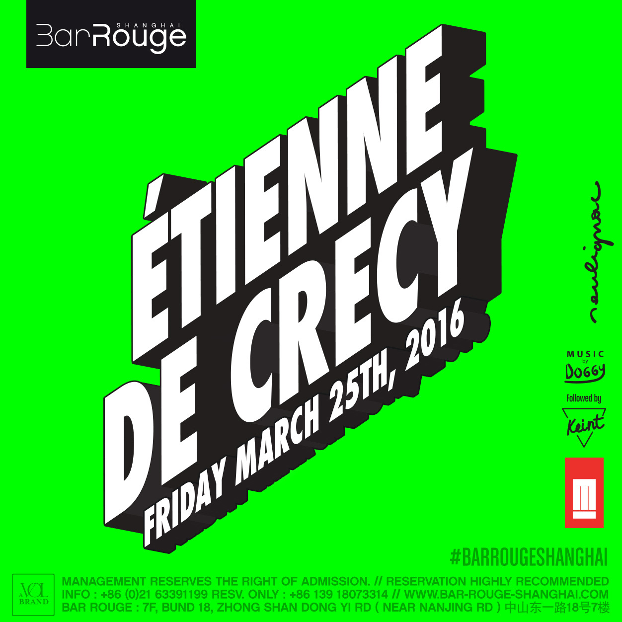


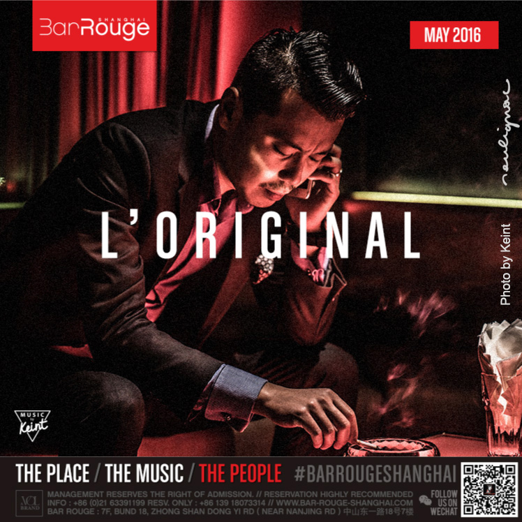
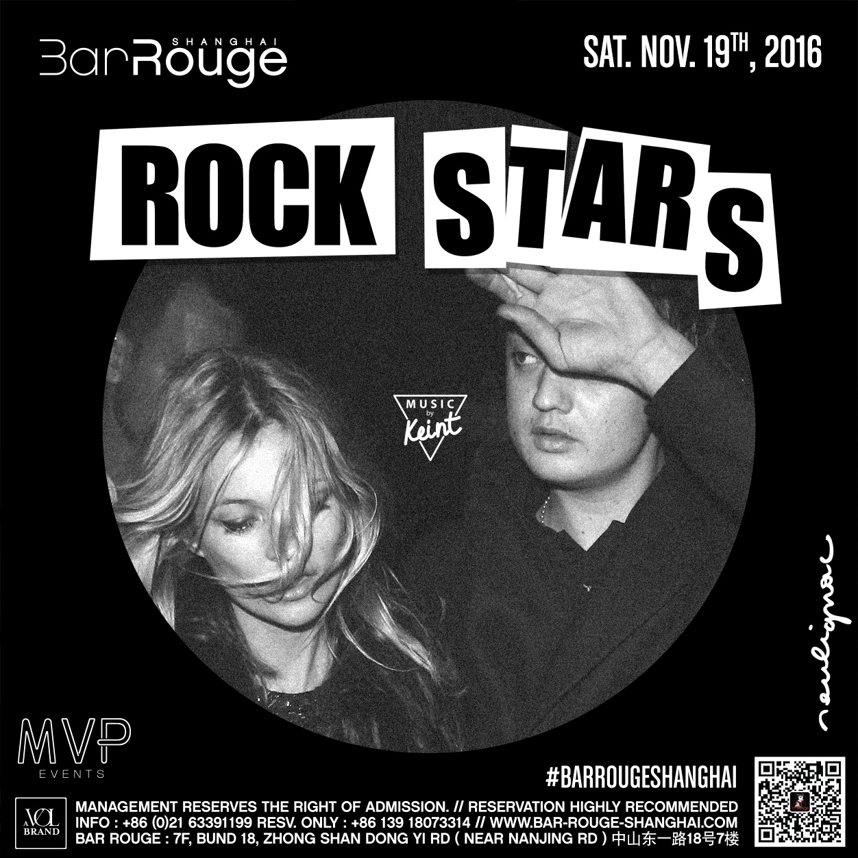
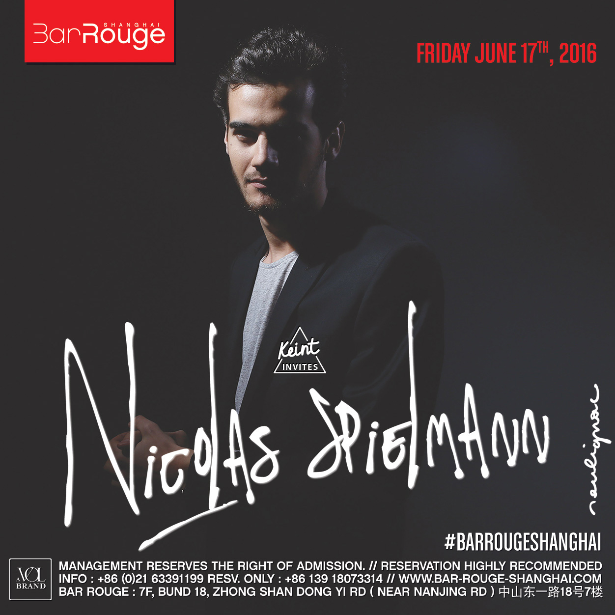

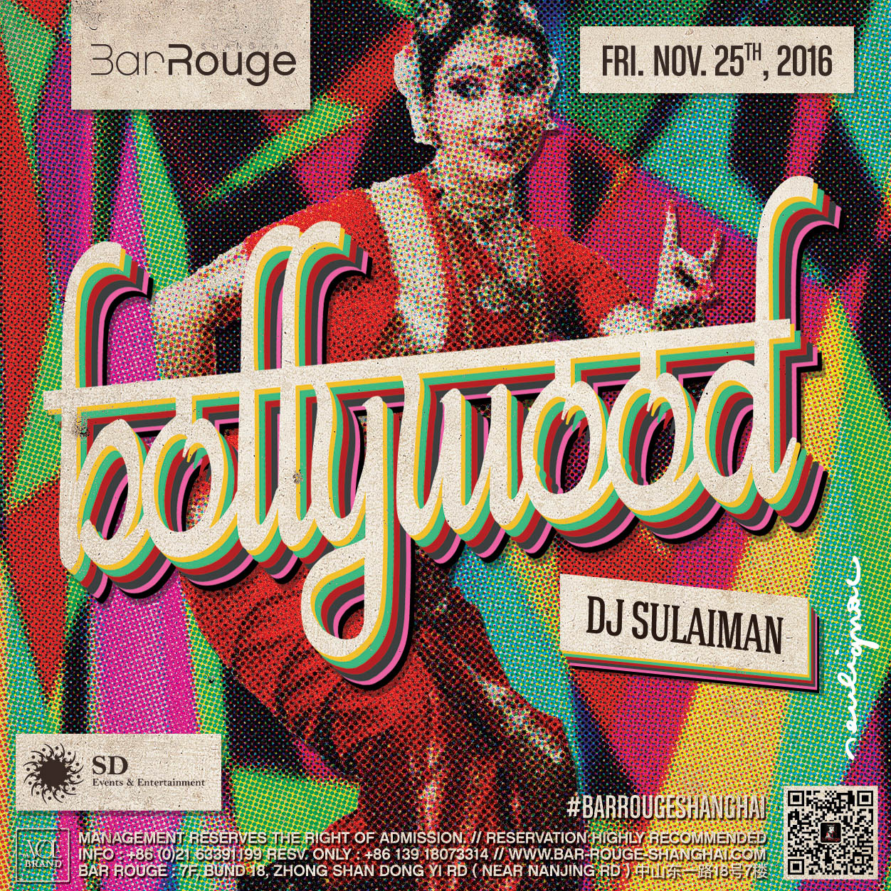


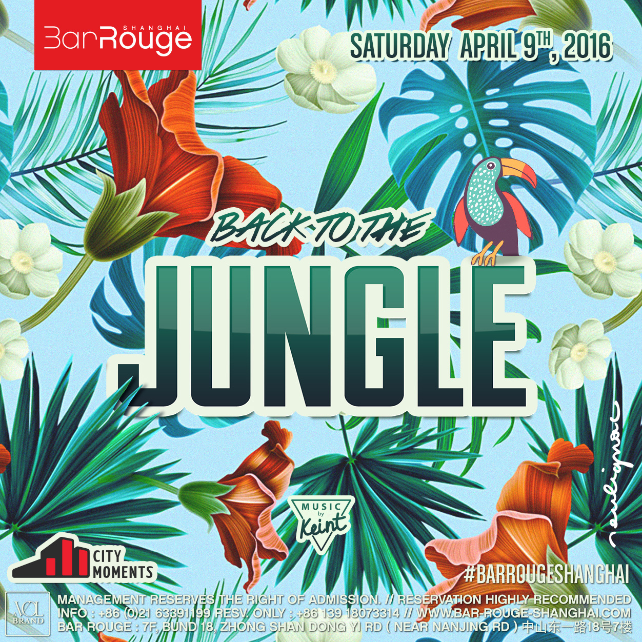
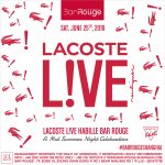
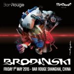
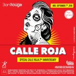
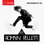
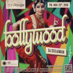
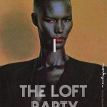
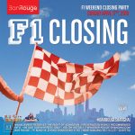
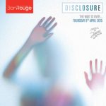
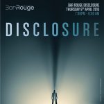
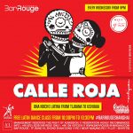
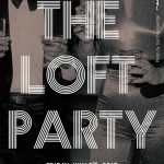
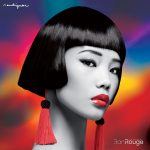
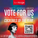
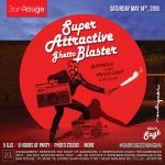
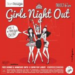
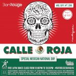
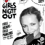
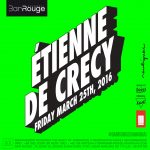
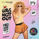
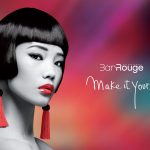
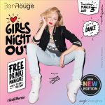
Flyers Design (short selection). Art direction & Graphic design by Francois Soulignac, Bar Rouge Shanghai, VOL Group China.
Branding | Series
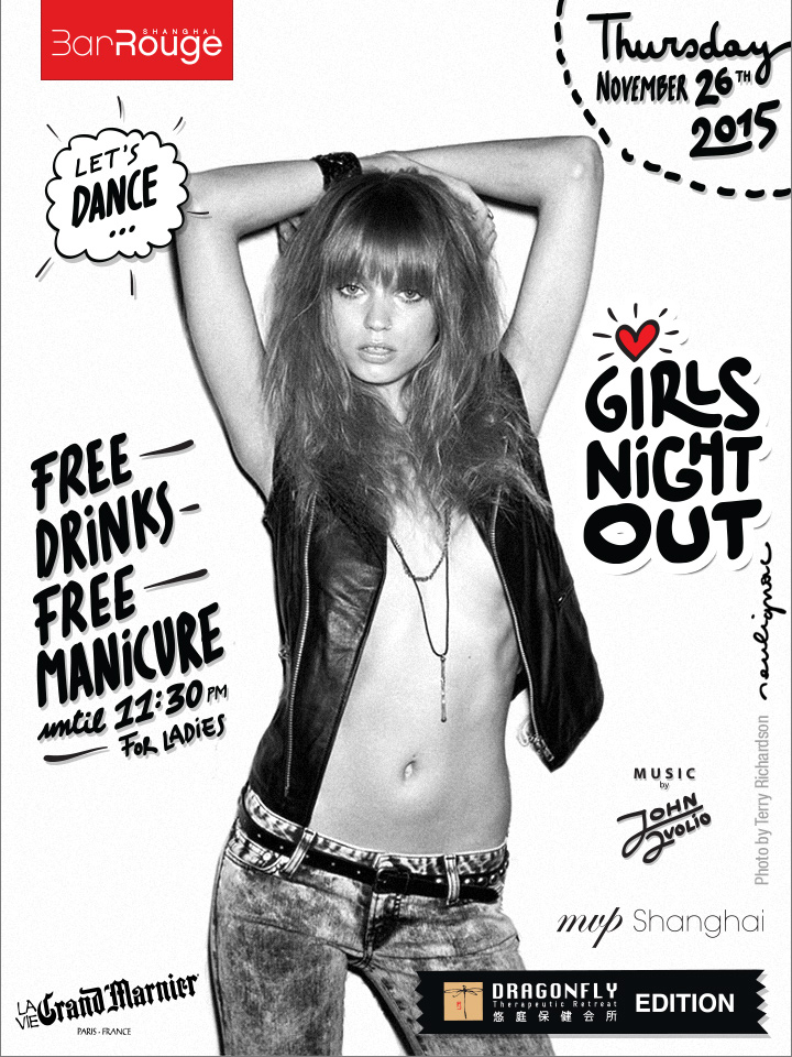
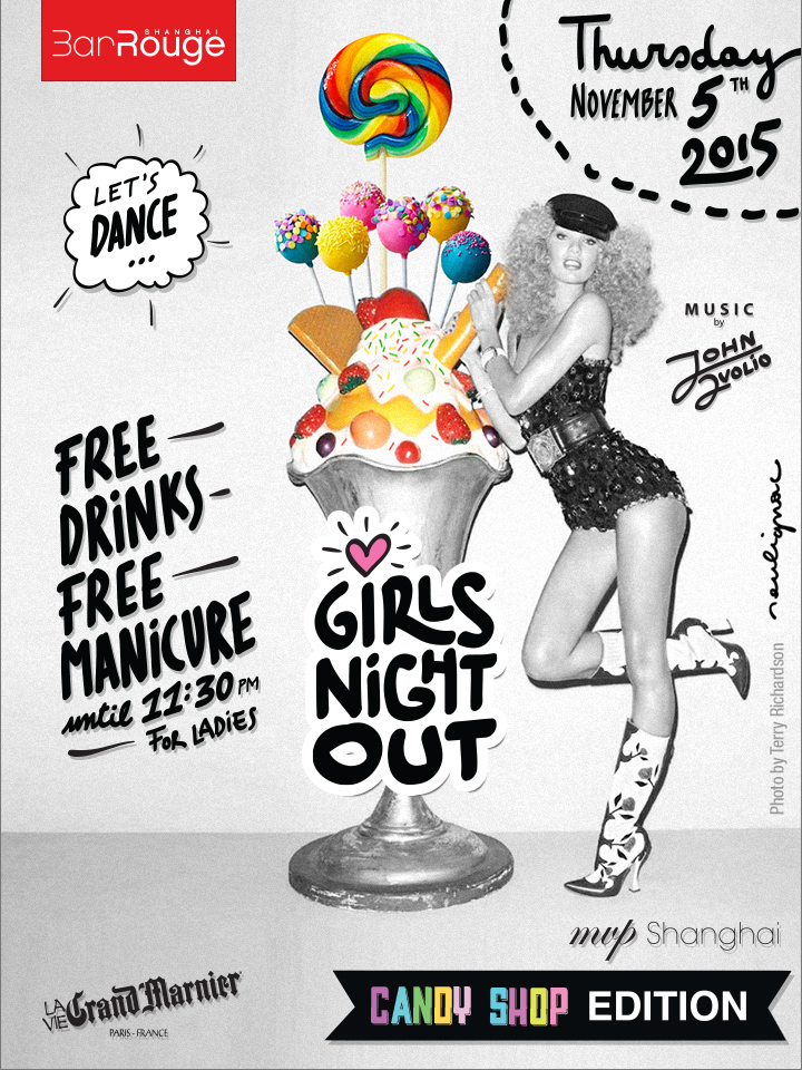
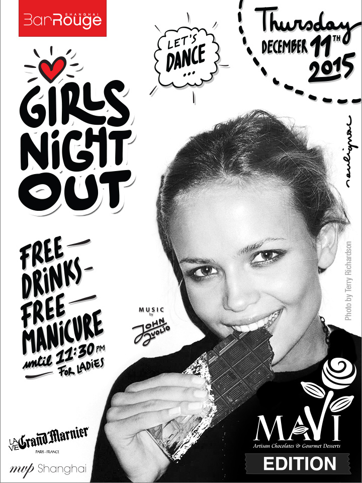
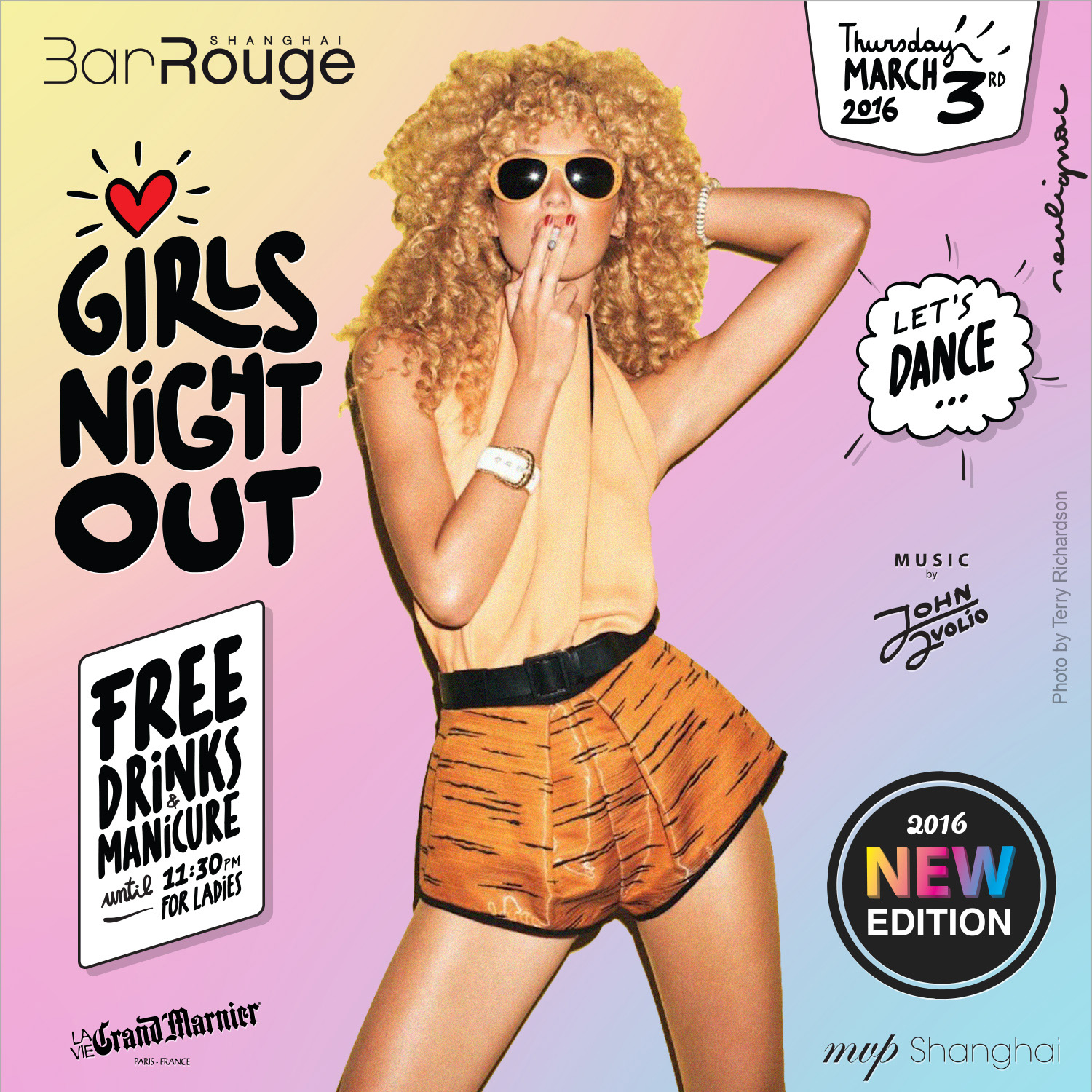
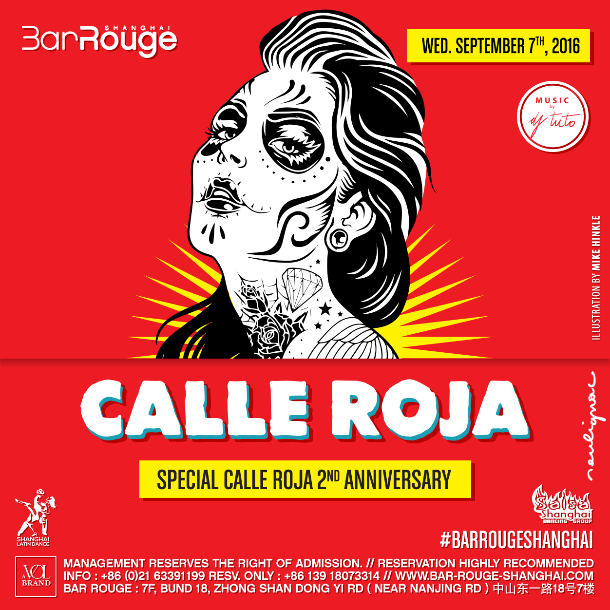


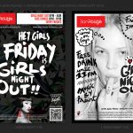
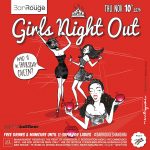
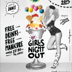
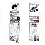
Flyers Design Series (short selection). Art direction & Graphic design by Francois Soulignac, Bar Rouge Shanghai, VOL Group China.

Video production
Brodinski & Gener8ion
Brodinski & Gener8ion, Brava Tour, Bar Rouge Shanghai with M Agency | Video by Clément Beurais, VOL Group China, 2015
Cut Killer. Video by François Soulignac
SAGB. Video by François Soulignac
SAGB. Video by François Soulignac
Bar Rouge Shanghai 10th Anniversary
Bar Rouge Shanghai 10th Anniversary | Video by Clément Beurais, Aerial views by 紫宁信息科技, VOL Group China, 2014
A co-working with locals & international talents
Antoine K.P. (Director, Bar Rouge Shanghai); Charles B. (Marketing & Sales Director, VOL Group China); Quentin F. aka Keint (Photographer, Artistic and Musical Director, Bar Rouge Shanghai); Jonathan B. (Project Manager, Bar Rouge Shanghai); Clément B. (Videographer); Lynn (Graphic Designer); Shasha (Graphic Designer); Shyla T. (Graphic Designer); Toni Z. (Graphic Designer); Preacher (Graphic Designer); Julia Z. (Graphic Designer); Danara S. (Illustrator); Vitaly T. (Photographer and Videographer); Pavel S. (Photographer); Oliver M. (Art Director, Photographer); 紫宁信息科技 (Drones & Aerial views).

Photos gallery
© 2015-2017, Bar Rouge Shanghai, VOL Group China – François Soulignac, Creative & Art Direction.
